Sovrex PTY LTD
Brand identity, two websites, and a full project campaign for a Sydney property development company
Sovrex PTY LTD is a Sydney-based property development company with a clear ambition: build a brand and digital presence that matched the quality of their work. The project ran across two phases — first establishing the Sovrex identity with a logo and corporate website, then creating the complete launch campaign for their flagship property project, Warnervale Garden.
Sovrex came referred through the same ownership circle as FinRex — a client who had already seen what a well-built brand could do for a business. They wanted a professional identity for the parent company that felt premium and trusted, with a deliberate visual kinship to FinRex while holding its own distinct character. Beyond the corporate brand, they were preparing to launch Warnervale Garden, a property development project on the New South Wales Central Coast. That project needed everything: a standalone website, a brochure that could go to investors and buyers, a polished presentation deck, a reusable proposal template, and a physical site signboard. Critically, all written content — every word across every piece — needed to be created from the ground up.
The brief had two distinct layers, each with its own pressure point. For the Sovrex brand itself, the challenge was creating a professional identity that shared the confidence and visual language of FinRex — because that was exactly what the client wanted — without becoming a copy. The two brands needed to feel like they came from the same design thinking while clearly belonging to different businesses. For the Warnervale Garden campaign, the challenge was producing a cohesive suite of materials across very different formats — digital website, printed brochure, presentation deck, proposal document, and a large-format site board — all anchored by content that had to be written from scratch. Property project materials in particular often read like legal documents. These needed to earn genuine interest from prospective buyers and investors.
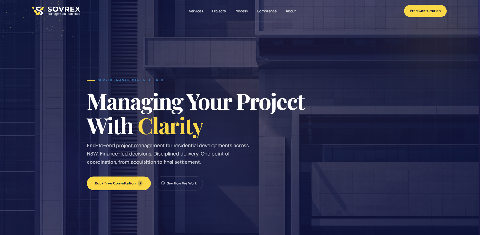
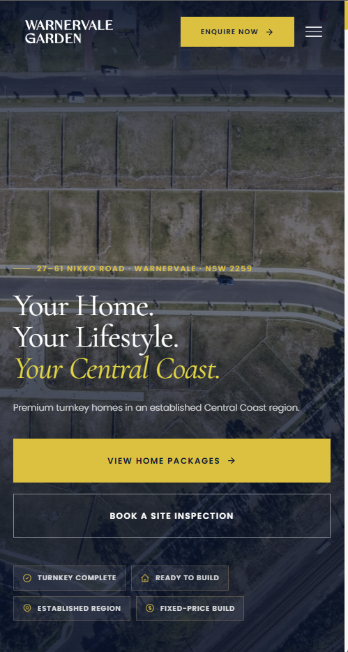
The Sovrex logo was developed with the same layered intentionality applied to FinRex — each element justified, nothing decorative for its own sake. The palette — deep indigo (#141041), medium indigo (#26225C), and gold (#FFD700) — was developed to sit within the same premium family as FinRex while giving Sovrex a clearly distinct register. Where FinRex leans towards cooler navy, Sovrex carries a warmer purple-indigo undertone that sets the two brands apart at a glance despite sharing the same ownership DNA. The wordmark was crafted to convey authority, precision, and the "Management Redefined" positioning the company stands behind. Both websites — sovrex.com.au and the Warnervale Garden project site — were built entirely from scratch using PHP, HTML, CSS, and JavaScript. No CMS, no theme, no templates. Every line of code was hand-written to ensure full control over performance, layout, and SEO structure from the ground up. Both sites are fully mobile-responsive and load fast on any device.
For Warnervale Garden, every word was written before a single page was designed — establishing the project's voice, its appeal to lifestyle-conscious buyers on the Central Coast, and the specific language that would resonate with both investors and families. The 15-page brochure was laid out on a generous grid with room to breathe, leading with the lifestyle vision before introducing the specifics of the development. The presentation deck was built for screen — clean, slide-by-slide, strong visual hierarchy and minimal text per slide. The project proposal template was designed to be reusable across future bids, with clearly structured sections Sovrex could populate without design support. The 8ft × 4ft site signboard was designed for maximum legibility at distance — bold type, project name dominant, a strong visual anchor on the approach road to the site.
Sovrex launched with a complete, professional identity and an immediately deployable project campaign. The Warnervale Garden website went live fully optimised, and the printed brochure was produced ready for distribution to prospective buyers and investors. The client had a polished, cohesive set of materials across every touchpoint — digital, print, and physical on-site — all from a single project engagement. The consistency across formats, and the quality of the written content, gave the development a presentation standard well above comparable projects in the region.
sovrex.com.au

Project Campaign
Warnervale Garden
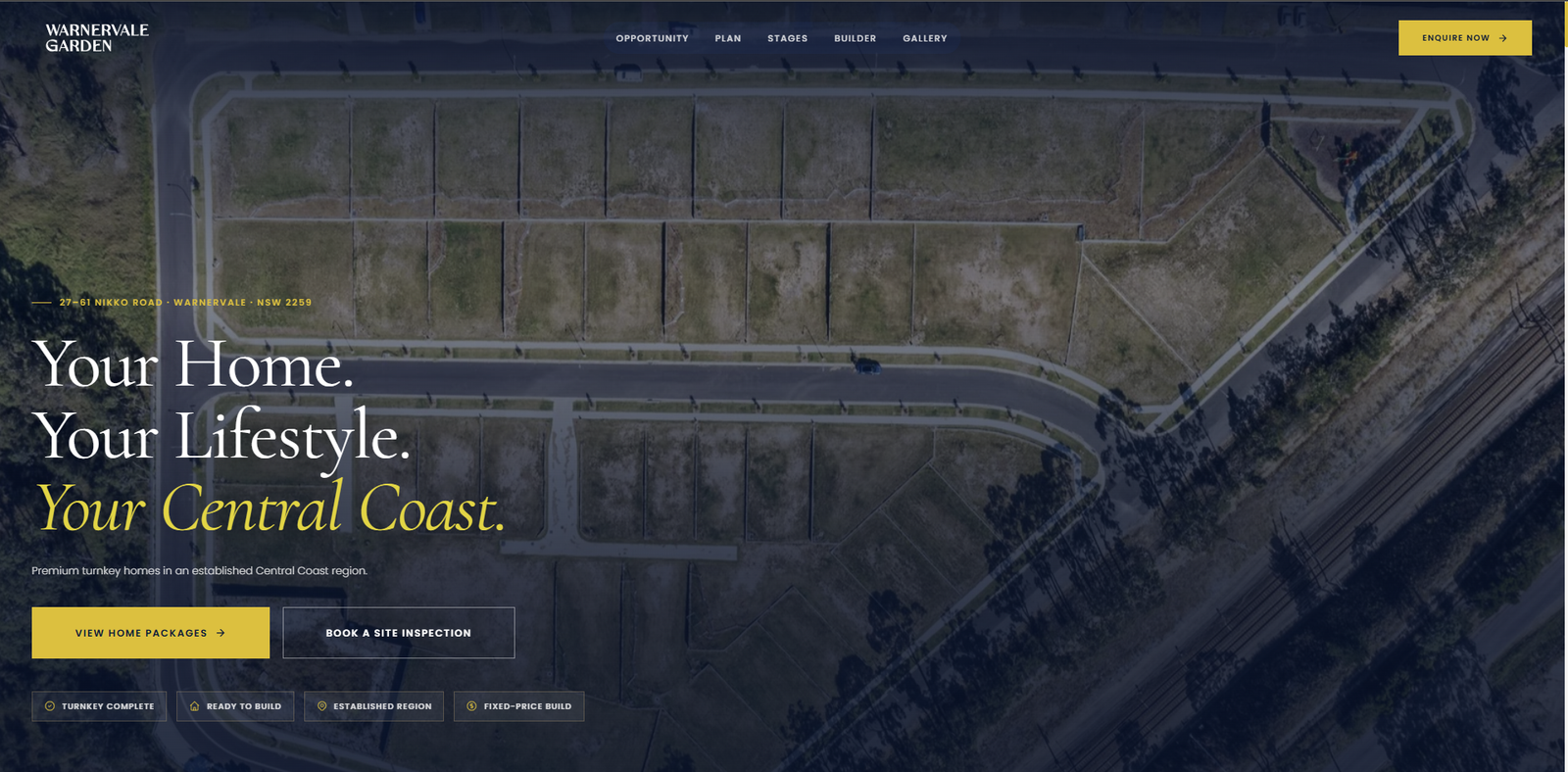
A 54-lot premium residential subdivision at 27–61 Nikko Road, Warnervale, on the NSW Central Coast. Every piece of the launch campaign — content, layout, and design — was built from scratch as a single, coherent system across five formats.
The primary sales document for 52 house and land packages
The brochure needed to do two things simultaneously: inspire lifestyle aspiration in first home buyers and families, and communicate development credibility to investors. All 15 pages of content were written from scratch — from the project overview and Central Coast location story through to lot specifications and package details. The writing came first. Only once the content had a clear voice and a defined argument for each page did the layout work begin.
The layout prioritises breathing room over information density. The lifestyle narrative leads — establishing what it feels like to live at Warnervale Garden before introducing the specifics of the development. Section dividers use full-bleed colour to give each chapter visual weight without adding copy. Typography and colour are drawn directly from the Sovrex brand system so the brochure reads as a natural extension of the corporate identity, not a separately produced marketing piece.
Stopping traffic on Nikko Road
At 8 feet wide, the signboard had a half-second to communicate project name, value proposition, and contact details to a driver passing at road speed. The design uses a strong diagonal split — the left two-thirds carry the brand message in bold white display type on deep navy, while the right third presents the actual site plan, letting prospective buyers see exactly where the 54 lots sit in relation to the roads, parkland, and the 25-metre E3 environmental corridor.
A gold octagonal badge carrying "SELLING NOW" sits at the intersection of the two panels — positioned to catch the eye at the precise point where both halves of the composition meet. The Sovrex logo and contact details anchor the lower left, formatted to be readable from a stationary vehicle. Every typographic decision was tested against the question: does this read at 20 metres?
A 12-section formal proposal designed to close the engagement
The project proposal was a business instrument, not a brochure — it needed to read like a serious, binding document while still making a compelling case for Sovrex as the development manager. The 12-section structure covers the full scope of the engagement: Executive Summary, Development Scope, Marketing Strategy, Sales Management, Builder Engagement, Legal & Contract Administration, Development Timeline, Risk Management, Reporting & Governance, Fee Proposal, Initial Budget, and Conclusion.
Every section was written with dual intent — to demonstrate expertise and to set clear operational expectations with the landowner, 61 Nikko Road Warnervale Pty Ltd. The design reflects this: clean chapter headings with large display numerals, structured body copy with consistent typographic hierarchy, and the Sovrex navy-gold brand system applied throughout. The document closes with a formal dual-signature agreement page, designed so it functions as both a pitch and an executable contract from the moment it's signed.
Built for a room — one idea per slide
The presentation deck was designed for screen delivery to investors and prospective buyers — structured to take an audience from the project overview through the development rationale, location advantages, lot details, and the buy-now case. The structure mirrors the proposal document but is calibrated for a different environment: larger type, more white space per slide, and a visual weight that reads clearly on a projected or shared-screen format.
The discipline here was editorial — keeping each slide to a single clear point, with supporting detail minimised. The Warnervale Garden typographic treatment (white headline on navy, gold accent rules) carries through from the signboard and brochure, so every touchpoint an investor encounters in a meeting reinforces the same visual system.
The physical package that holds the campaign together
The corporate presentation folder was designed to house all printed collateral — brochure, site plans, specification sheets — in a single, professional package for buyer and investor meetings. Die-cut to accommodate an A4 document pocket and a business card slot, the folder carries the full Sovrex brand treatment: deep navy cover stock, gold rule accents, and the "Management Redefined" tagline on the back panel. Supplied print-ready with 3mm bleed and full CMYK profiles for offset production.
The folder was designed as a system component, not an afterthought — it's the first physical object a buyer touches, and it sets the tone for everything inside it.
Warnervale Garden
Reflection
The biggest lesson from this project was about where design actually begins. Warnervale Garden wasn't primarily a visual problem — it was a communication problem, and every design decision depended on getting the content right first. Writing the proposal structure, the brochure narrative, the signboard headline, and the presentation story before opening any design application meant that when I did start laying things out, the decisions were already made. The layout didn't need to carry the weight of figuring out what to say. It just needed to make what was already being said as clear and compelling as possible. When content and design are developed as a single process — not handed off in sequence — the work goes faster and the output is more coherent. Every piece in this campaign shows that.
"Arnab handled everything — the brand, the website, the brochure, the proposal, the signboard, the presentation. Every word and every page. We went to market with a campaign that looked and read like it came from a serious development company, because he understood what Warnervale Garden needed to say to buyers and investors and made it look the part. We couldn't have asked for more from a single person."
Deliverables
- Logo & Wordmark System
- Brand Identity Guidelines
- Custom Website — sovrex.com.au
- Custom Website — Warnervale Garden
- Project Brochure (15 Pages)
- Presentation Deck
- Project Proposal Template
- Print Folder Template
- Site Signboard (8ft × 4ft)
- Full Content Writing
Tools Used
- Adobe Illustrator
- Adobe InDesign
- Adobe Photoshop
- PHP
- HTML / CSS
- JavaScript
- Figma